Patients Google you, then book somewhere else. Your website is why
Patients decide in minutes whether your clinic looks trustworthy. A blunt checklist of what your website must show: real photos, real doctors, real reviews, and one obvious booking button.
Ammar Mahmood, Founder, Zeliks
4 min read
Clinic-website advice is everywhere on Instagram right now, and it all points at the same problem. Ace360degree's carousel lists the four questions patients ask before they trust a clinic: can I trust this doctor, does the clinic look professional, is booking easy, what do other patients say. Most clinic sites fail at least two of the four.
CONTOUR's September 11, 2026 carousel lists five red flags: the site is not mobile-first, the next step is unclear, the site looks nothing like the real clinic, there is too much information, and there are no reviews or credentials. DigiLantern's September 7, 2026 post adds the SEO side: separate service pages, clear local information, fast mobile performance, real doctor profiles. The pattern is consistent: clinics keep building generic brochure sites when patients need trust signals and a booking button.
Your patient decides in two minutes
Nobody reads your clinic website. They scan it. Photo of the doctor: real person or stock photo? Booking: one tap or a phone number buried in the footer? Reviews: visible or missing? Address and timings: on the first screen or three clicks deep? Two minutes, four checks, decision made.
The patient who leaves does not tell you. They just book the clinic whose site answered the questions. You never see the loss in your analytics. You see it in the empty slots.
Show the actual clinic
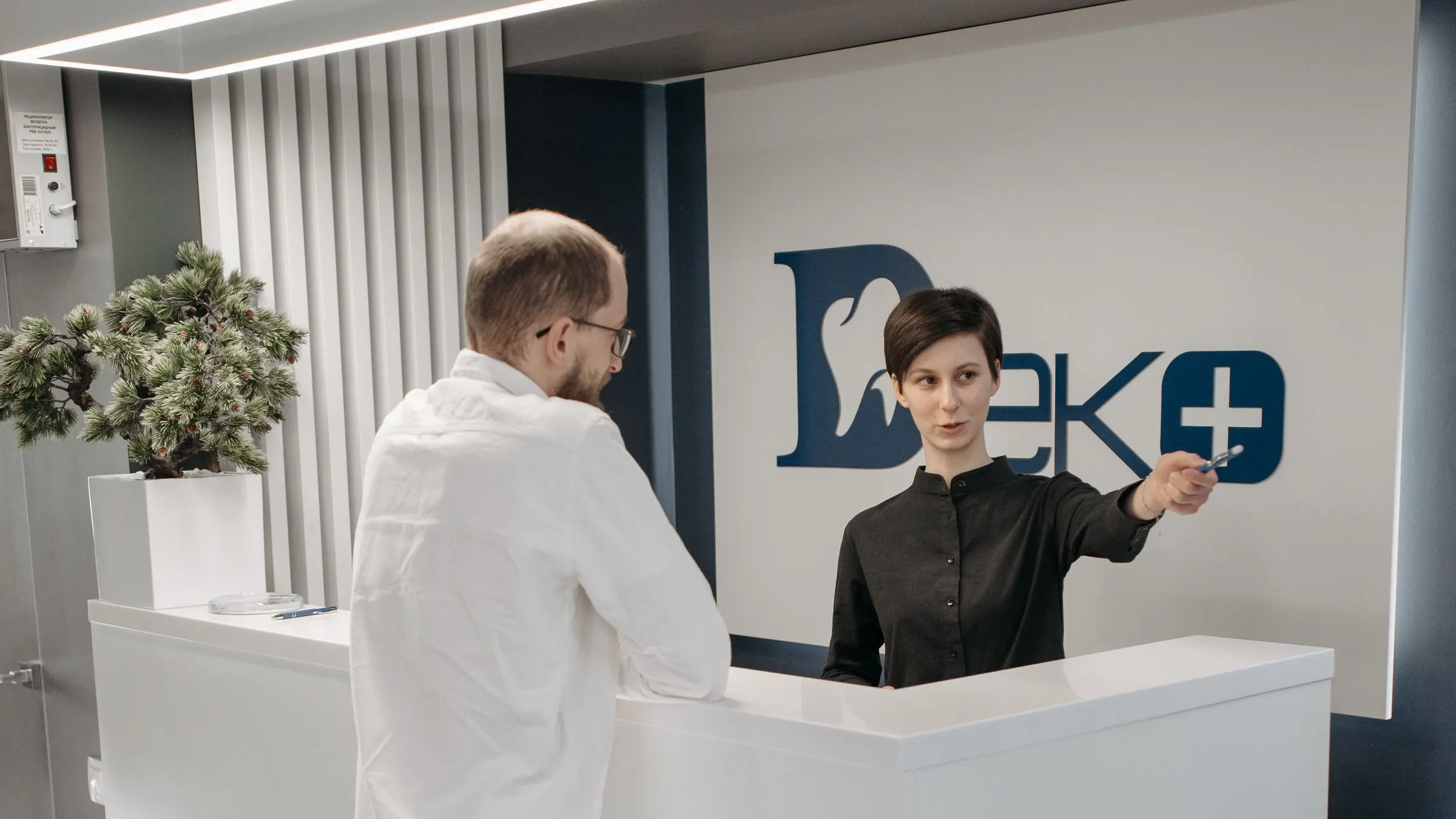
The most common failure is also the easiest to fix: the site shows a gleaming stock-photo clinic and the real one looks nothing like it. Patients feel tricked before they arrive. Use real photos of your rooms, your chair, your reception. A modest real clinic beats a fake fancy one.
Same for the doctor. A real photo, real qualifications, real specializations. A line like "Dr. Sharma, MDS Orthodontics, 12 years of practice" answers the trust question. A smiling stranger in a white coat does not.
Make booking the loudest thing on the page
One obvious button, on the first screen, on every page: book on WhatsApp, or call. Not a contact form that promises a reply within 24 hours. A patient in pain does not fill forms. They tap the biggest button.
We covered the booking flow itself in our post on WhatsApp appointment booking for dental clinics: confirmation, reminders, rescheduling by reply. The website's job is simpler: get the patient into that flow in one tap.
The sixty-second mobile test
Open your clinic site on your phone right now and run four checks. One: can you see a real photo of the clinic or doctor without scrolling? Two: is there a booking or call button on the first screen? Three: can you find the address and timings in under ten seconds? Four: does it load before you get impatient?
Every check you fail is a patient you lose to the clinic whose site passes. Fix them in that order: photos, button, address, speed. That is an afternoon of work for most sites, and it is the highest-value afternoon you will spend on marketing this year.
Borrow trust you have already earned
Your Google reviews are sitting there, doing nothing on your site. Embed them. Ten real reviews with names beat a paragraph you wrote about yourself. Put your rating near the booking button, where the decision happens.
List your services as separate pages, one per treatment, in plain words: root canal treatment in Kochi, not clever specialty jargon. Patients search their problem, not your degree. DigiLantern's advice holds: each service gets its own page, its own plain title, its own booking button.
Before-and-after photos work too, with written consent from the patient. One real smile transformation beats a page of treatment descriptions. Keep them honest: same lighting, no filters, real results. Patients can spot a stock smile from a mile away.
Talk to Zeliks
Common questions
- What do patients check on a clinic website?
- Four things: whether they can trust the doctor, whether the clinic looks professional, whether booking is easy, and what other patients say.
- Should a clinic website use stock photos?
- No. Use real photos of your actual rooms and your actual doctors. A modest real clinic builds more trust than a fake fancy one.
- What is the most important element on a clinic homepage?
- One obvious booking button on the first screen: book on WhatsApp or call. Patients in pain tap the biggest button; they do not fill forms.
- How should clinic services be organized on the site?
- One page per treatment, titled in the plain words patients search for, each with its own booking button.
Written by Ammar Mahmood, Founder of Zeliks. We build websites, apps, AI assistants and automation. About Zeliks